MSA Brand Refresh
Branding
The Challenge
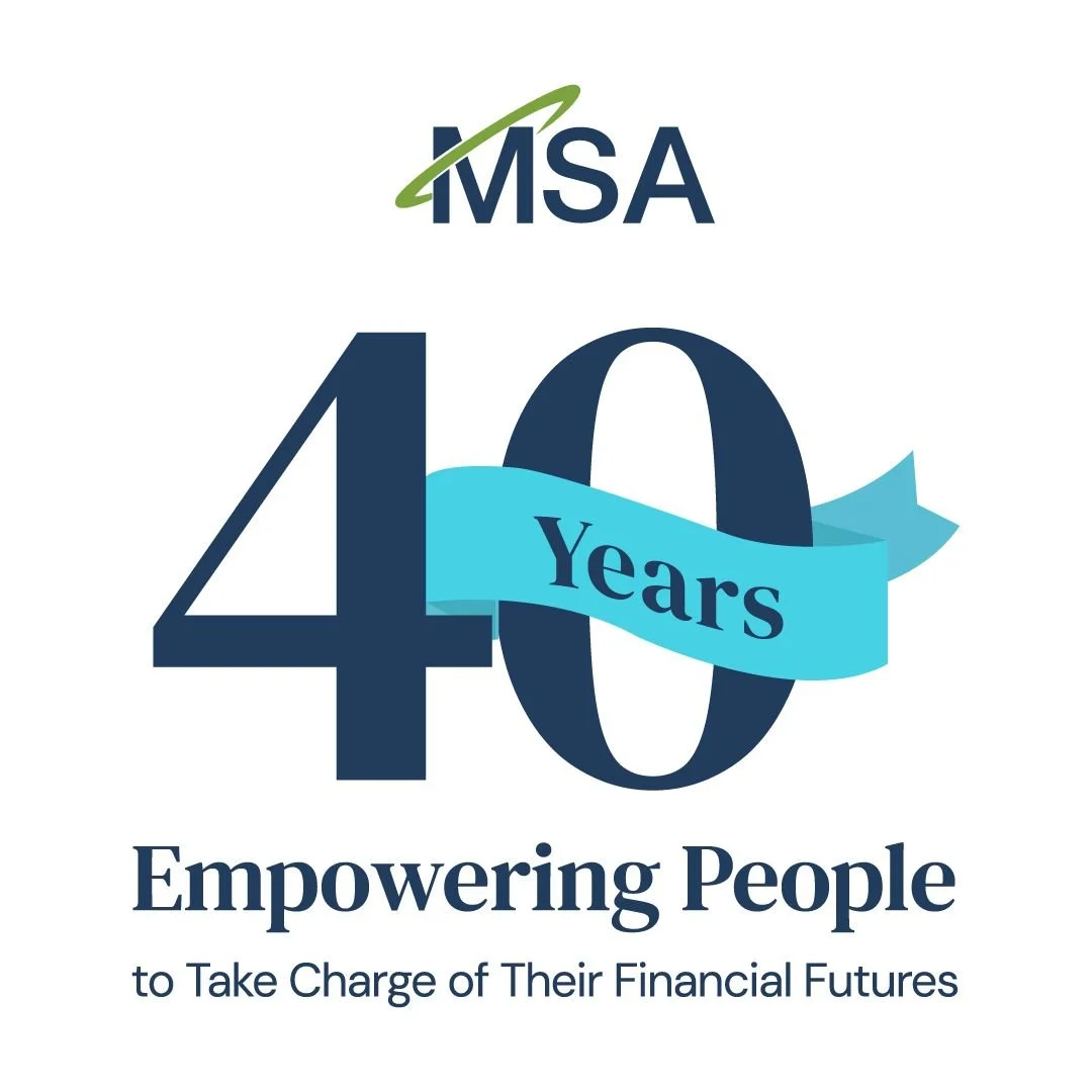
As a leader in financial wellness, MSA has been in the industry for over 40 years. They needed a refresh that felt modern, relevant, and accessible without losing the trust built over four decades. The recognizable MSA logo is the core of the brand, so it needed to remain as an anchor.
The Result
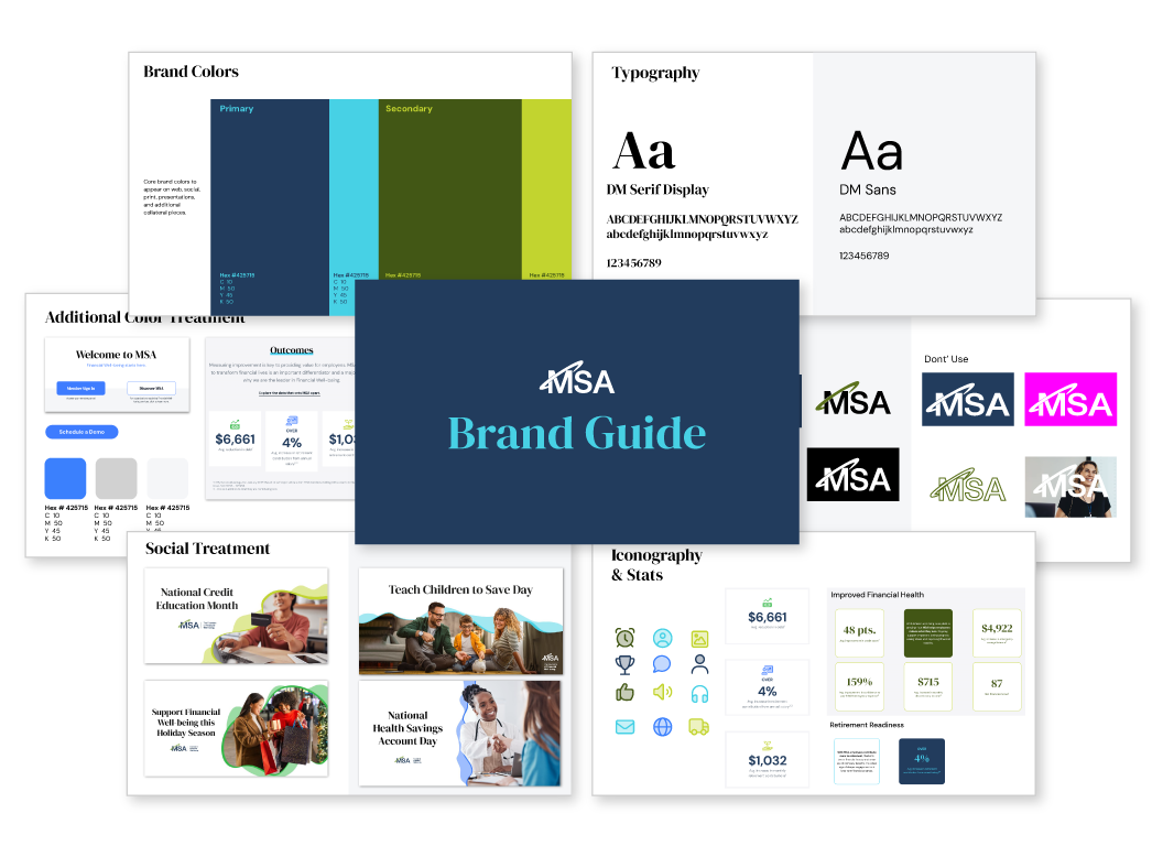
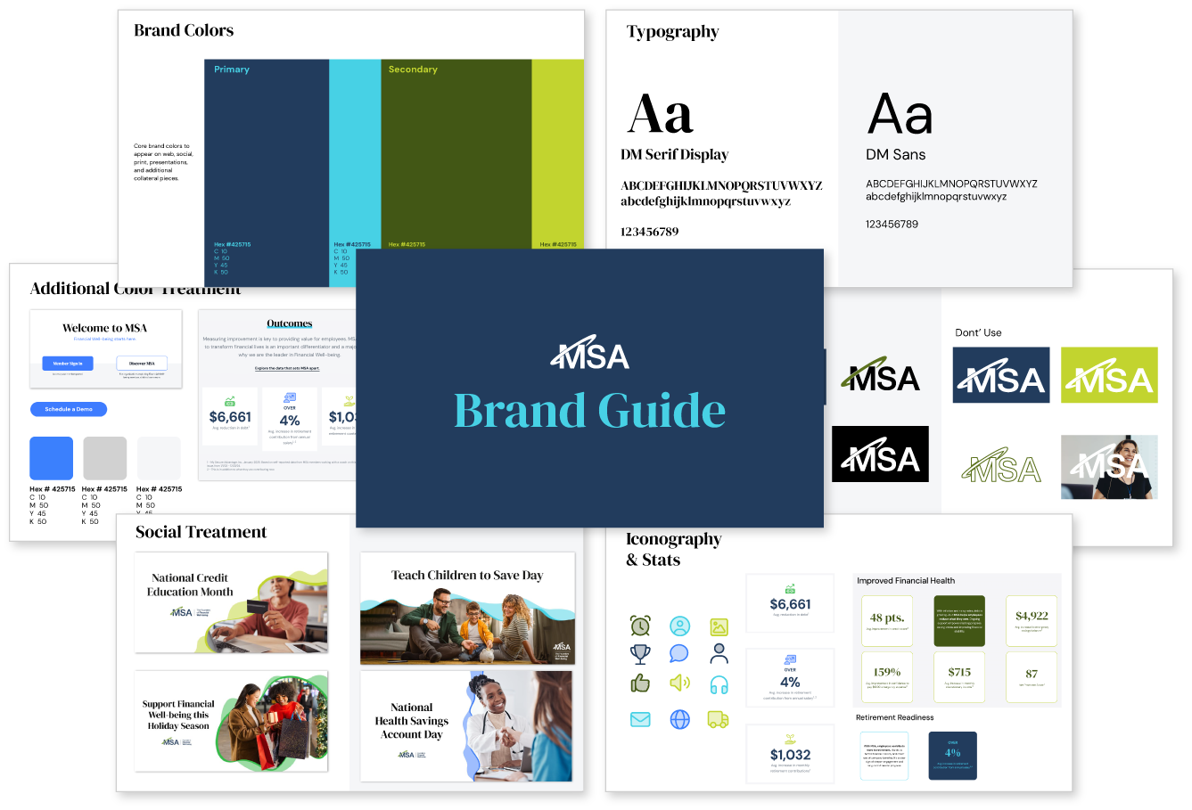
I anchored the refresh in navy and hunter green, drawn from the brand's established palette, and set those as the primary colors. Modern aqua and teal act as accents, brightening the palette without overwhelming it.
DM Serif brings a trusted, yet modern voice to the brand. DM Sans is the ideal secondary font — web-friendly, crisp, and clean.
Duotone icons add a playful, approachable element. They do a lot of the heavy lifting on education decks, infographics, and web stats.